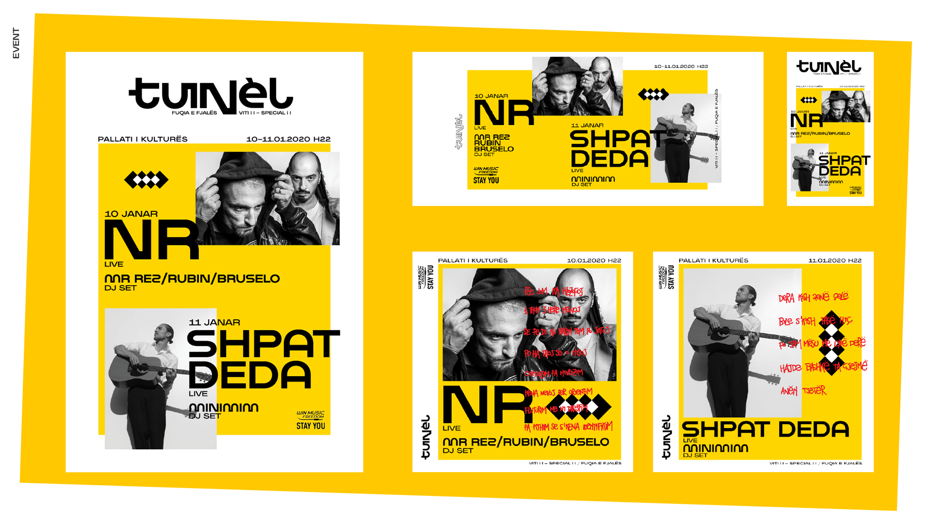
This identity was conceived to be dynamic and flexible.
The idea is to always have a white container where all the elements combine together.
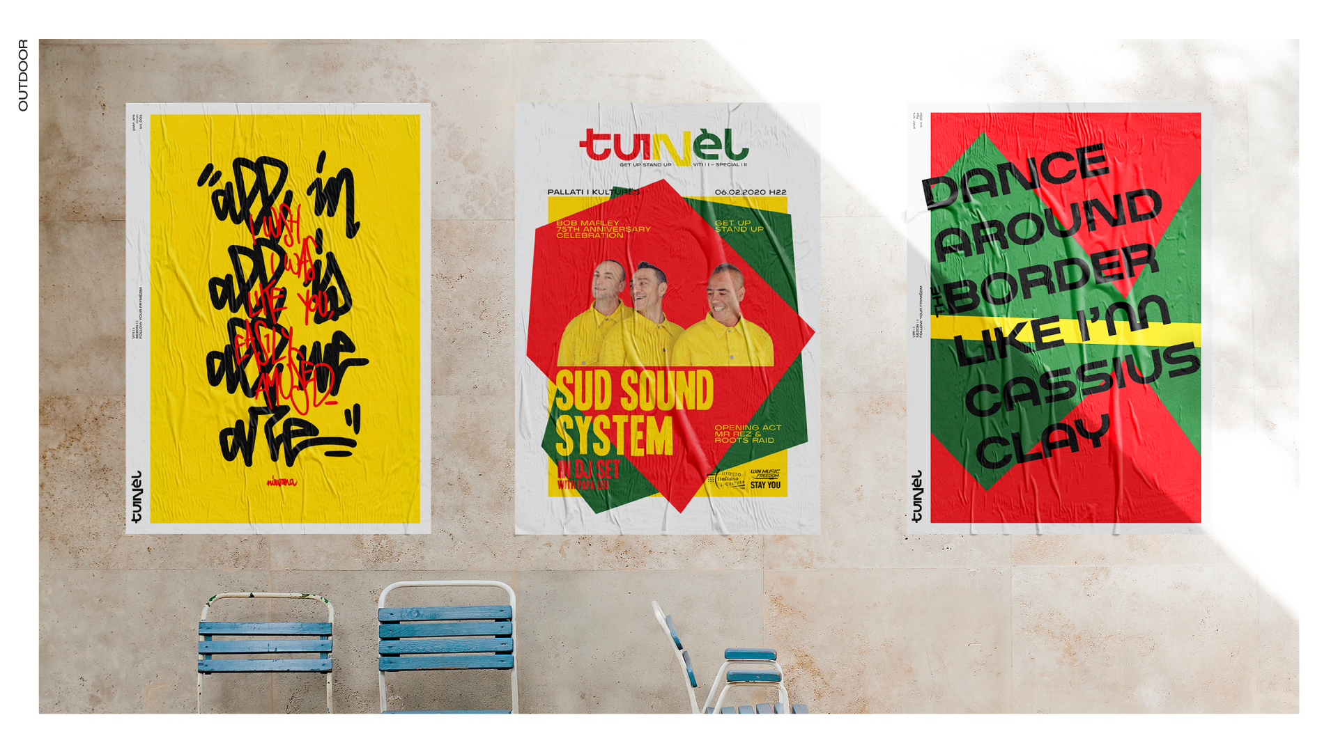
In the posters the logo, big on top, wants to recall the logos of magazine covers.
The yellow choice as primary color is a tribute to Ben Kelly and his Hacienda posters.
The identity is easily adaptable to square, horizontal and vertical format.
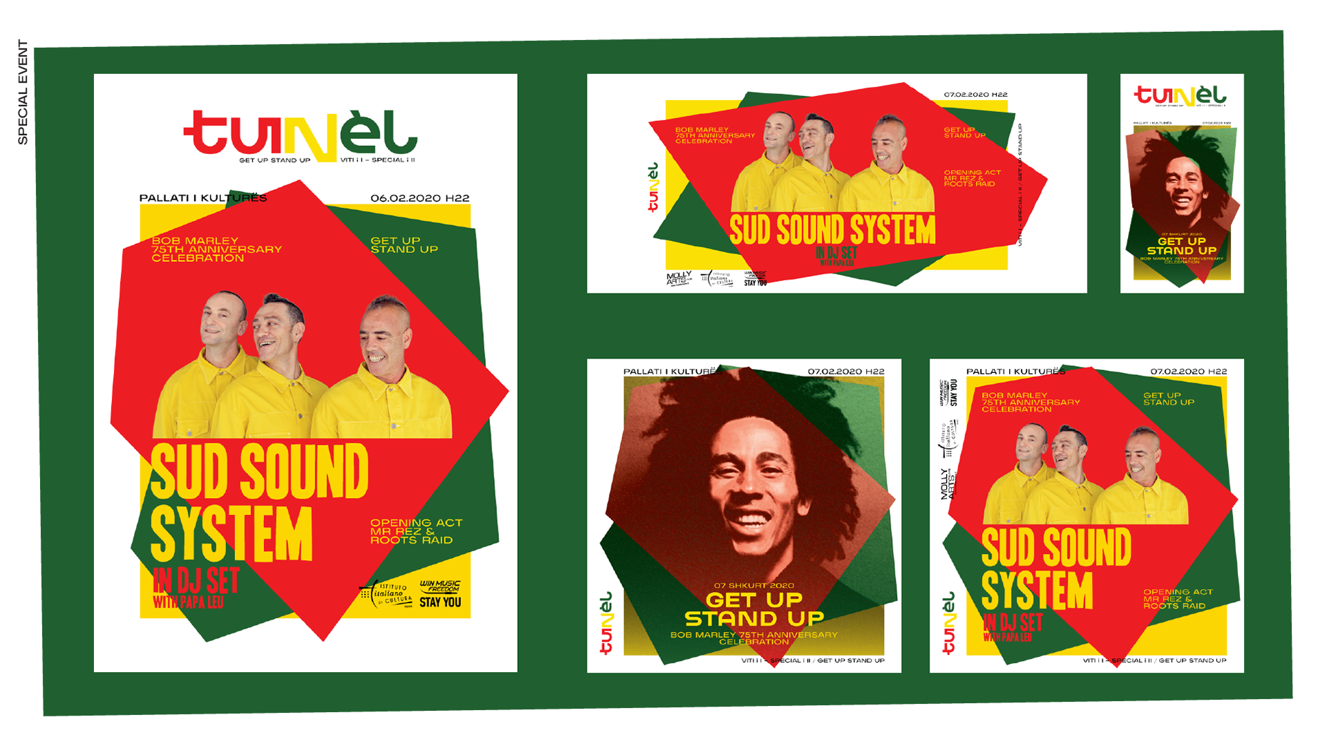
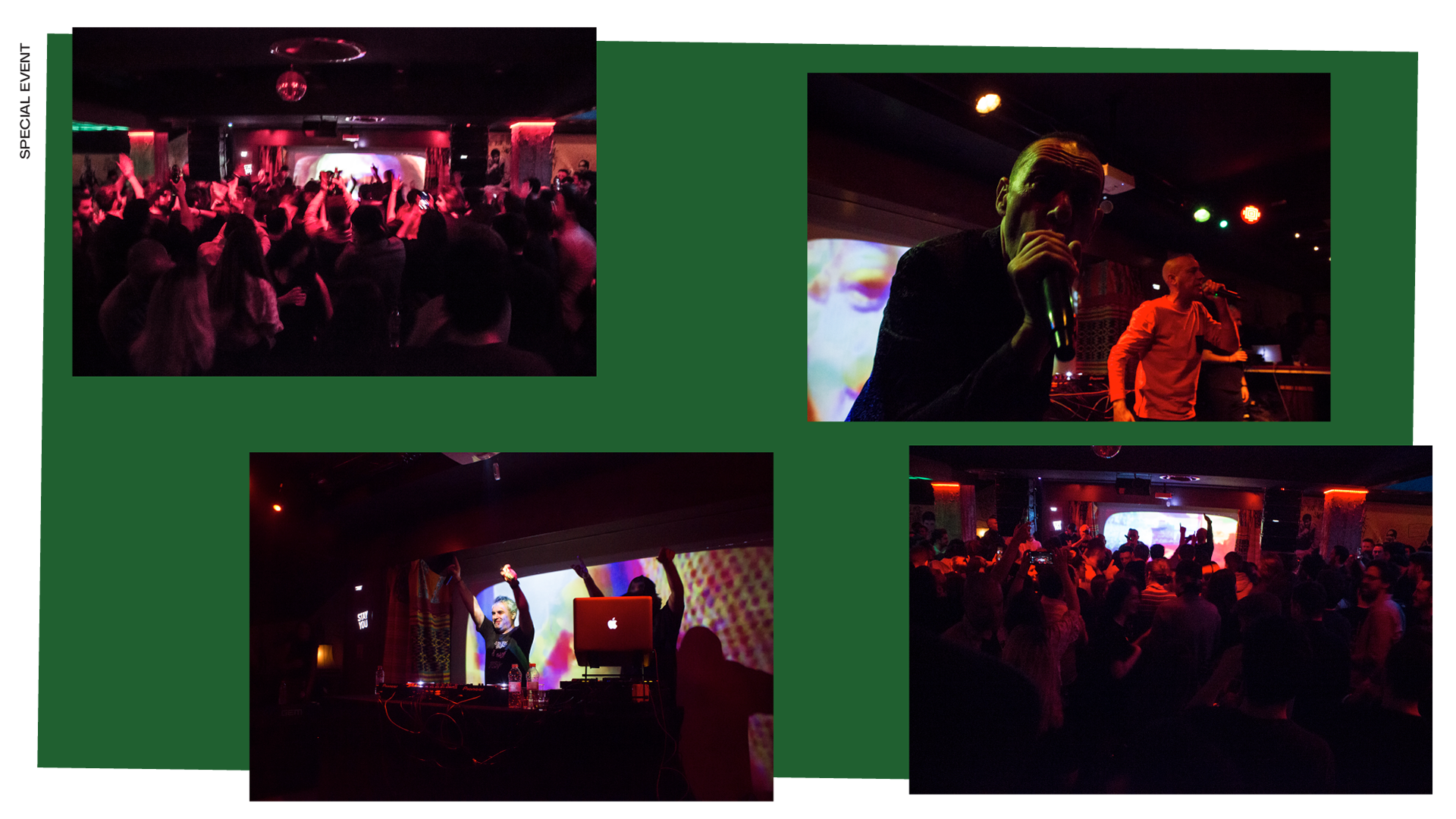
In case of special event, the whole layout undergoes changes in shapes and colors, but always keeping a defined identity and consistency.
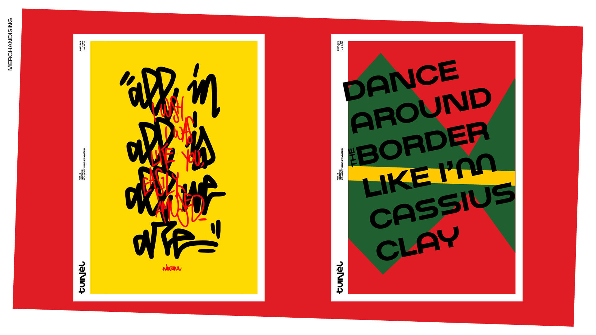
As merch, some posters were created posters with quotes from the bands present on the walls of the venue.
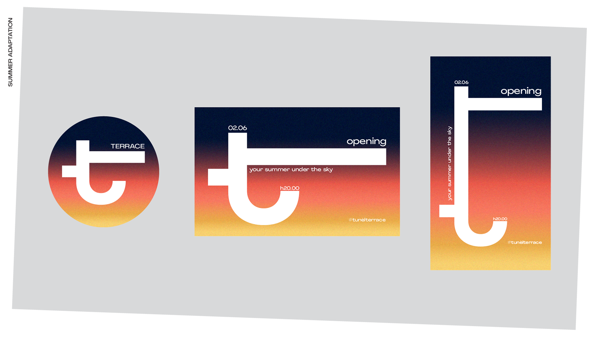
Logo was adapted for the terrace that opens in summer.
The right arm of the T elongates to represent the terrace. The color palette moves to a smooth summer sunset gradient.
The right arm of the T elongates to represent the terrace. The color palette moves to a smooth summer sunset gradient.
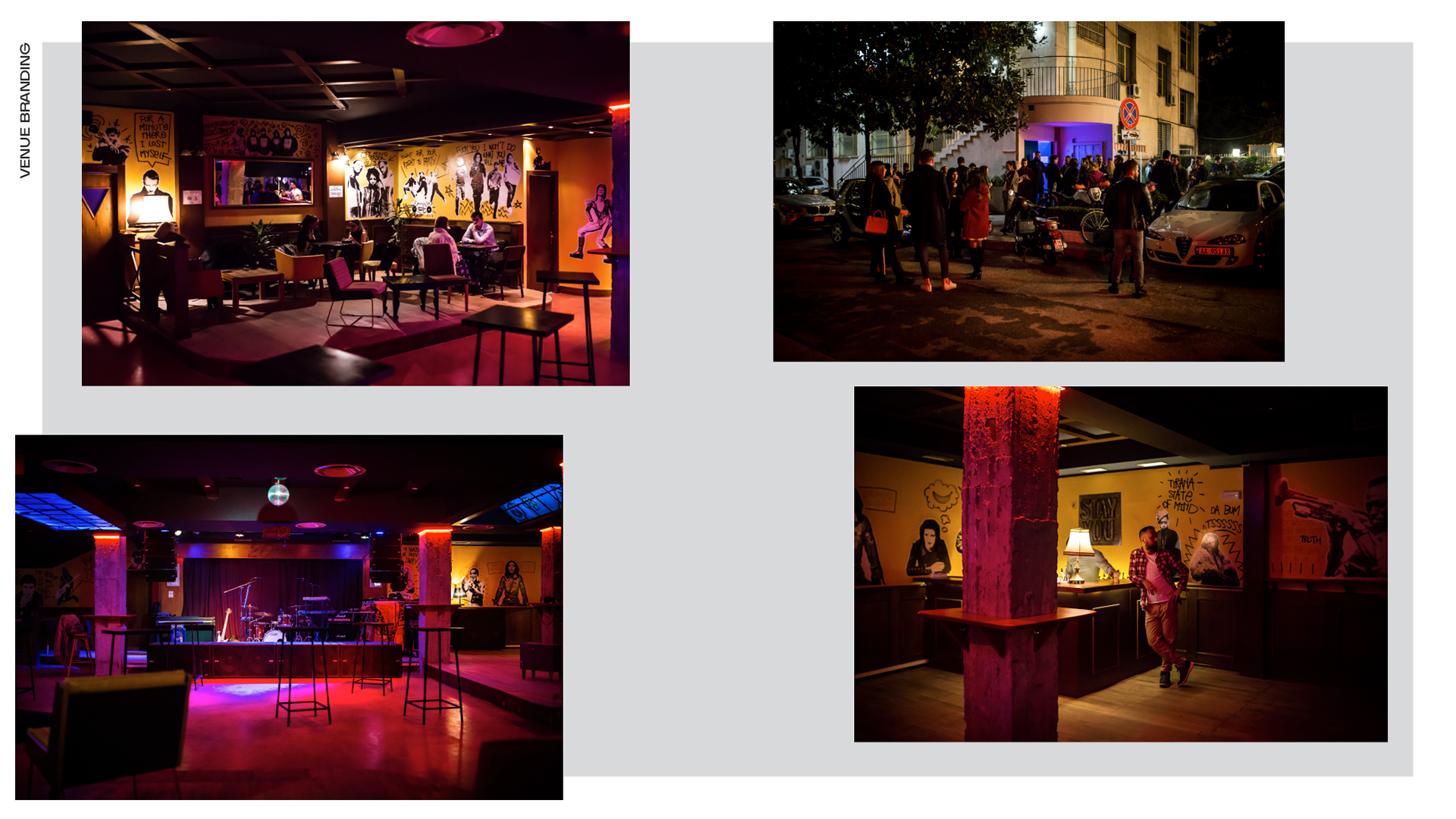
I also realized the walls branding in collaboration with the artist Ergin Zaloshnja.
He realized the paste-ups of iconic artists and I took care of the lettering.