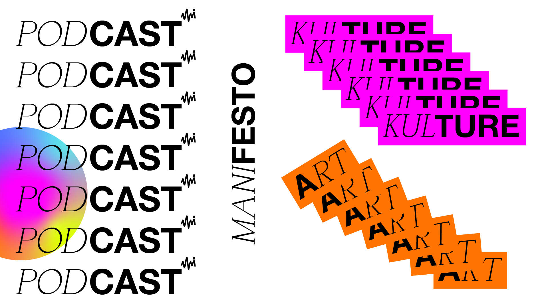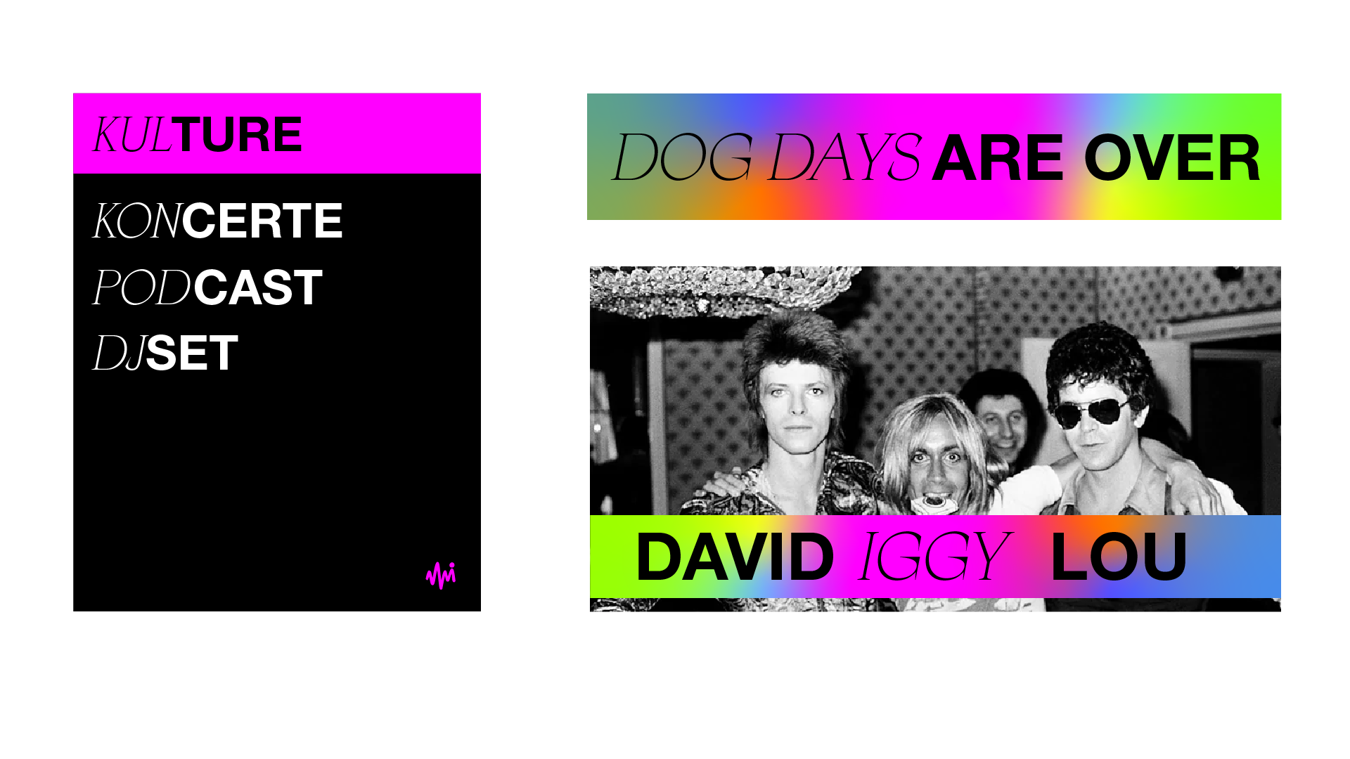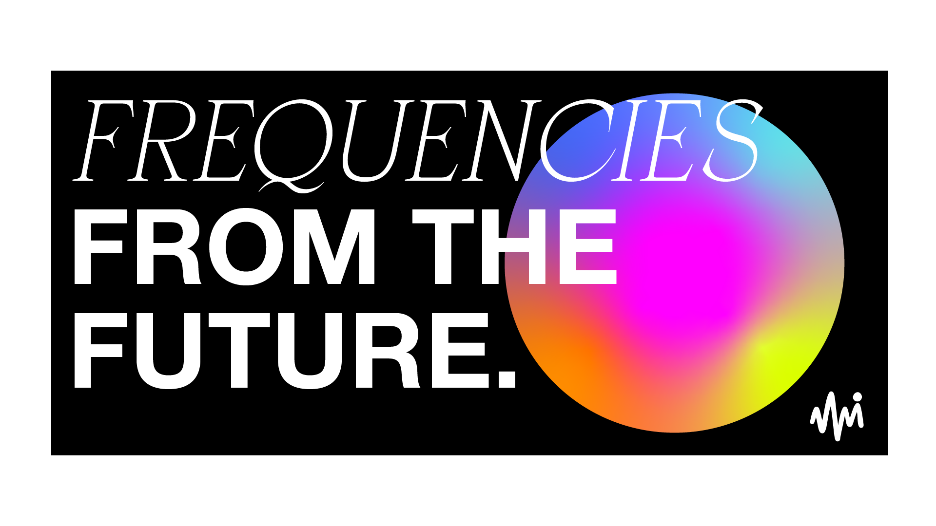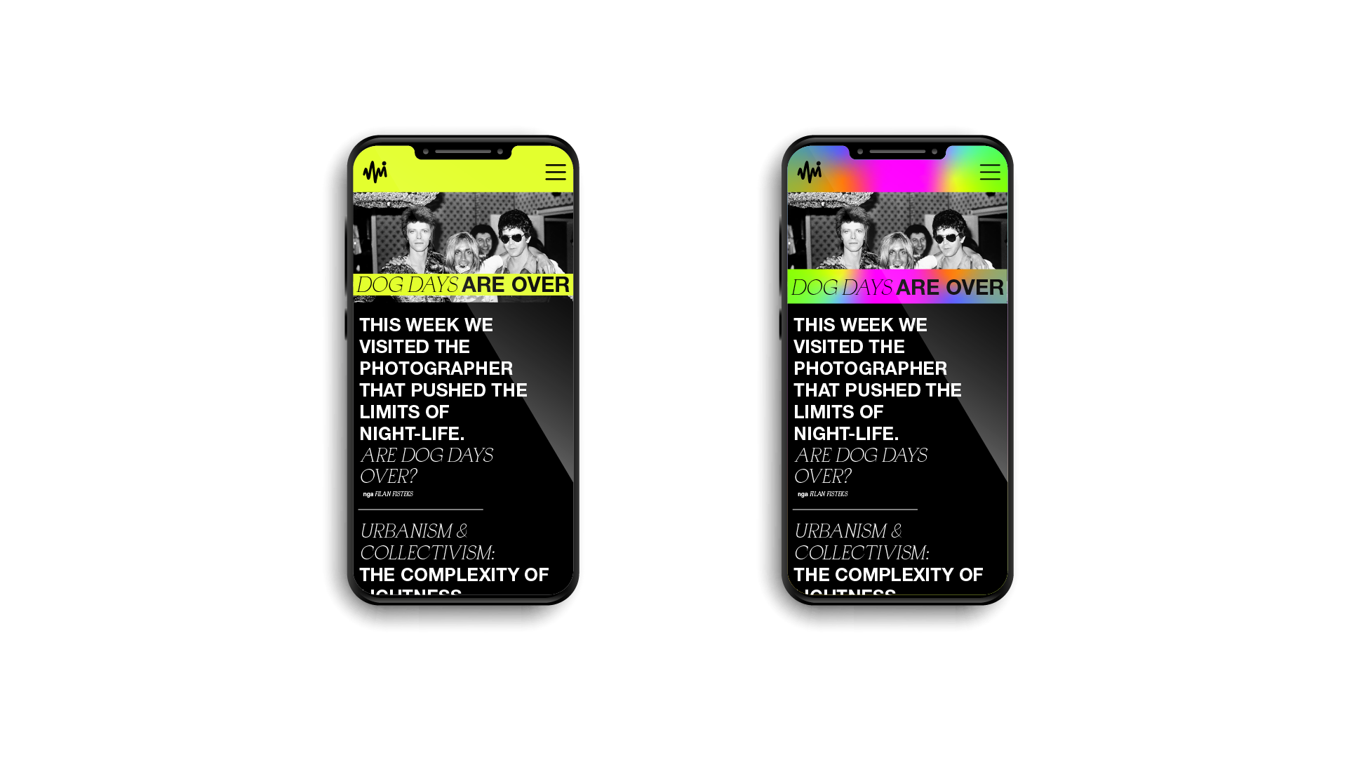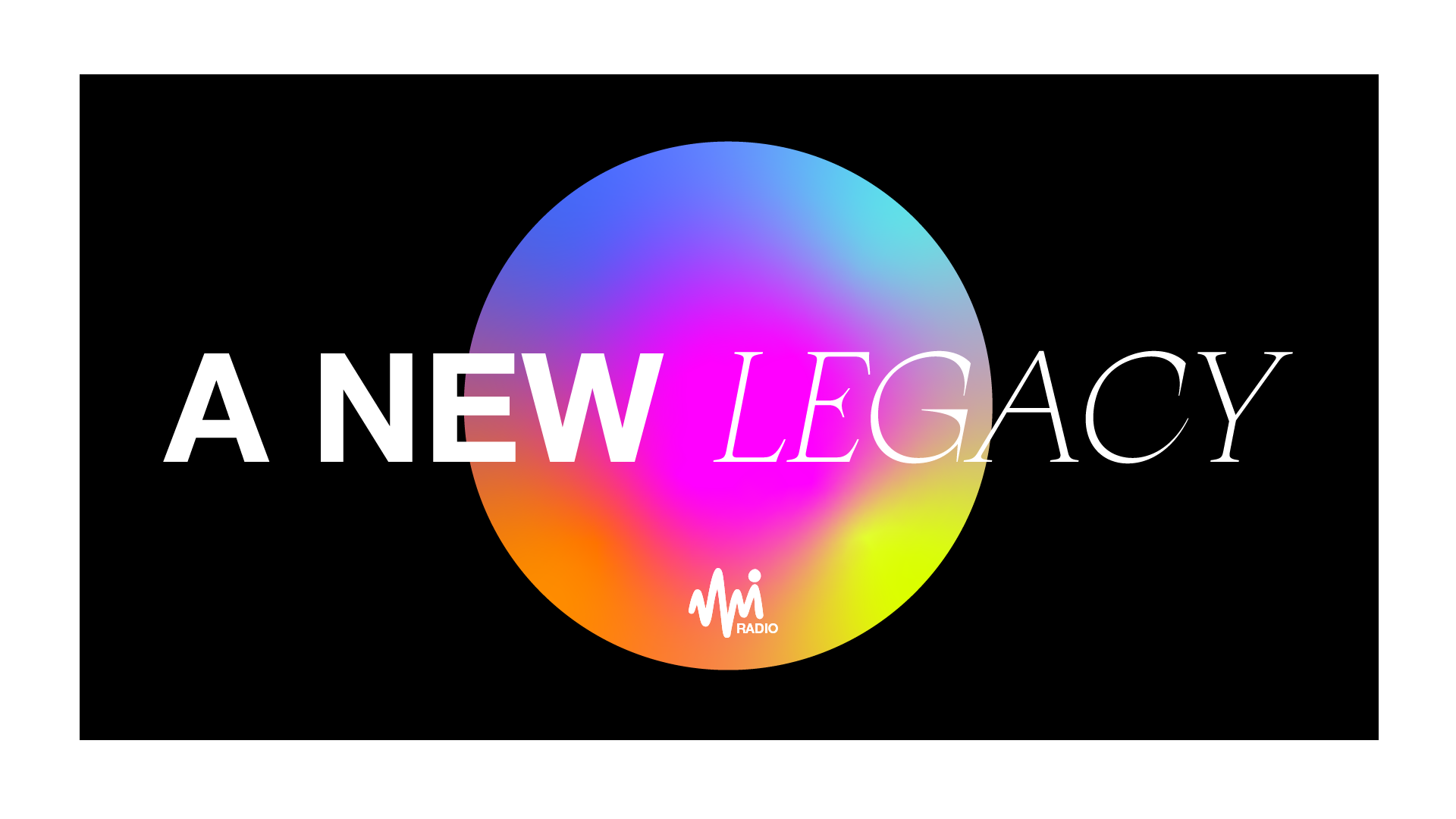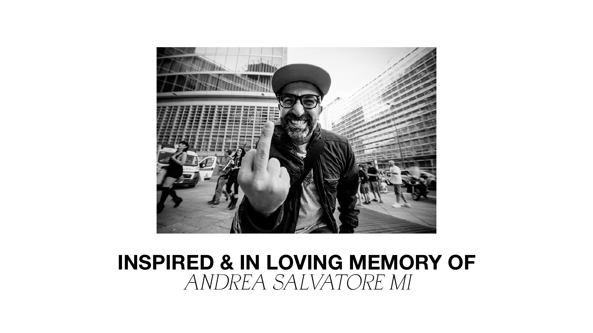

Radio MI. A space where rational and emotional mix perfectly together. The nietzschian dichotomy, Apollonian and Dionysian, is deeply rooted in the spirit of the platform, as well as it was in the person who inspired it, Andrea Mi. Said dichotomy between rational and emotional is also expressed visually. The logo is a mix of a classic typeface and the freehand design of “mi”, that also represents the sign of the heartbeat. The rigor of the black is integrated with neon colors and the freedom of holographic gradients. The cleanliness of Helvetica is integrated with an atypical serif font, Apocalypse.